As I and many others have been warning about for the past year or so, the upcoming so-called "work requirements" (aka "paperwork hell" requirements) of last year's Big Ugly Bill are ramping up in January...and in fact have already begun in Nebraska. A few days ago the Centers for Medicare & Medicaid Services (CMS) published their "final rule" with the reporting and exemption regulations which every state which has expanded Medicaid under the Affordable Care Act will be required to follow...and, as expected, it's likely to be a disaster.
Advocates for people with serious illnesses, like cancer and HIV, say the strict Medicaid work rules that the Trump administration released this week are likely to put ongoing treatments in jeopardy.
In 2020, Oklahoma voters passed Medicaid expansion, adding more people to Soonercare. Republican lawmakers are advancing proposed constitutional changes to reverse that vote: House Bill 4440 and House Joint Resolution 1067.
If approved, both state questions would give lawmakers the ability to adjust or reverse Oklahoma’s expanded Medicaid eligibility without a majority vote of approval by Oklahomans, with one acting as a failsafe in case the other is unsuccessful during the Aug. 15 primary runoff.
...Both measures passed the Senate Rules Committee along party lines on Monday.
Democrats say the process to approve the measures in the Senate feels ‘intentionally chaotic.’
Expanded Medicaid eligibility extends government-subsidized health coverage to adults aged 19-64 with incomes up to 138% of the federal poverty level. Today, adults made eligible by the expansion vote account for just over a fifth of all Oklahomans enrolled.
Over at The New Republic, Greg Sargent has taken this thinking one step further, noting that by delaying so much of the ugliness of the new law until 2027 or beyond...
Republicans know how unpopular all this will be. So they’ve structured the bill so the tax cuts land immediately, while many of the Medicaid cuts get going in 2027 and 2028. That’s meant to spare them in the midterms.
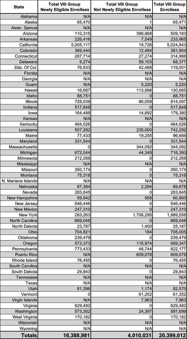
According to the new report, total enrollment from December 2024 through June 2025 dropped by 517,000 people, or roughly 2.5%, standing at 20.4 million nationally as of last June, so it doesn't look like the Trump Admin has started cooking these particular books, at least not yet.
Over at The New Republic, Greg Sargent has taken this thinking one step further, noting that by delaying so much of the ugliness of the new law until 2027 or beyond...
Republicans know how unpopular all this will be. So they’ve structured the bill so the tax cuts land immediately, while many of the Medicaid cuts get going in 2027 and 2028. That’s meant to spare them in the midterms.
According to the new report, total enrollment from December 2024 through March 2025 only dropped slightly (just over 30,000 people, or just 0.14%), and remained at over 20.7 million nationally, so it doesn't look like the Trump Admin has started cooking these particular books, at least not yet.
I've been able to cobble together more recent ACA expansion enrollment for about half of the 40 states (+DC) which participate in the program; since March, expansion enrollment has dropped in some states but is actually up in some others. It remains remarkably stable so far, although this is going to change radically with the draconian provisions of the GOP's Big Ugly Bill starting to kick in soon.
According to the new report, total enrollment from September through December actually increased by just a hair (5,377) and still remained at over 20.7 million nationally, so it doesn't look like the Trump Admin has started cooking these particular books, at least not yet.
I've been able to cobble together more recent ACA expansion enrollment for about half of the 40 states (+DC) which participate in the program:
Now that I've finally completed overhauling & updating my House District Healthcare Enrollment Pie Chart project with the latest data, I wanted to address a rather frustrating elephant in the room.
For most of the healthcare programs involved, the enrollment data is now reasonably up to date:
With the pending dire threat to several of these programs (primarily Medicaid & the ACA) from the House Republican Budget Proposal which recently passed, I'm going a step further and am generating pie charts which visualize just how much of every Congressional District's total population is at risk of losing healthcare coverage.
USE THE DROP-DOWN MENU ABOVE TO FIND YOUR STATE & DISTRICT.